How the Apple logo emerged
The Apple logo is - as the company name implies - an apple. More precisely, it's a bitten-into apple.
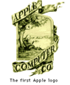
But this bitten-into apple was not their logo from the beginning: The first logo was an image with a figure that sits under a tree and hunkers over a document.
Above the depicted person, there's an apple, which was later adopted for the new logo. The whole picture was delimited by a sort of frame with a sash that said "Apple Computer Co."
Alltogether, the logo rather looked like an old etching and was designed in a much to complex way. This is why Apple commissioned a redesign with Regis McKenna.
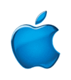
He designed the well-known bitten-into apple, which is still used in this form as Apple's logo today.
How the name Apple was chosen:
In the literature about Apple and the Apple logo, the question of how the company was named is answered in different ways. Steve Jobs, founder of Apple Computers, stated that he just wanted to have his company appear before Atari in the phone book. Another explanation is that the apple was chosen because Jobs was/is a strict vegetarian, and wanted to express this in the logo.
Other sources claim that Jobs returned from a holiday just before the naming. In his vacation spot, the apple harvest was just going on, and this is said to have inspired him to the name.
Jobs was a fan of The Beatles, who were signed with Apple Records. Thus, another theory is that Jobs was inspired by this circumstance.
You see, there are several theories to explain the origination of Apple Computers and the Apple logo.
Associations of the Apple logo:
The Apple logo provokes associations with christian, religious genesis mythology, where the bitten-into apple leads to the explusion from paradise. The expulsion was god's punishment for adam & eve's bite into the apple of the Tree of Knowledge of Good and Evil.
This mythological impression (genesis myth) was not chosen consciously by the logo designers, but Apple still benefits from it today.
The rainbow colouring of the Apple logo:
The rainbow and its colours symbolize hope and a bridge to heaven, and consequently the return to paradise. The meaning could also be interpreted as positive and visionary. This meaning is concordant with Apple - their developments being supposed to add to a better world.
Today's Apple logo:
Today's logo is not much different from the rainbow-coloured Apple logo. The contours of the old logo were kept, and the colours were removed.
The logo is put to use in different colours, which includes the "glass"-style which is typical for Apple. There's always only one colour (or one colour gradient) in the logo.